Part 2 of this article is available here, and Part 3 here
Clinicians often consider statistics to be a dry and challenging subject. However, an understanding of the basics of statistic methods underpins the interpretation and use of current best evidence from systemic research. Evidence based medicine, which seeks to integrate best available evidence from systematic research with individual clinical proficiency, uses mathematical estimates to quantify benefits and harm.
Apart from research, where a hypothesis is tested using certain criteria, statistical methods are also employed in audit, where aspects of care, processes and structure are compared to explicit criteria. In this series the authors aim to provide an overview of the basics of statistics for clinicians, starting with basic data handling techniques.
Quantitative data explained
Statistics are primarily the science of presentation, analysis, and interpretation of numerical information or data. In descriptive statistics raw data is simplified and presented as graphs, tables and summary statistics such as mean and standard deviation. Inferential statistics uses analysis of data to draw conclusions about a study population of interest. The sample data represents the wider population according to the laws of probability.
Note that qualitative data is distinct from quantitative data because it is non-numerical in nature, including opinions and text that is usually derived from contact with the research participants through various methods including interviews and focus groups. Quantitative data can be split up into observational and experimental data [1]. Observational data is data that has been collected without the use of a study or an investigation unlike experimental data.
Raw data is the original, unorganised data in which trends and patterns are not easily observable [2].
It is vital to note the differences between a variable and a statistic – a variable is a data value that varies within the population, such as height. On the other hand, a statistic is a value calculated from the set of data that summarises the data in some way [3]. An example of this is the average value of the heights collected.
Quantitative data can be split up into continuous data and discrete data. Discrete data can only take certain values, e.g. gender. Continuous data is data that can take any value; an example would be weight [3]. Data can also be classed as categorical [2]. Categorical is subdivided into nominal (relates to named items such as blood group, ethnicity) and ordinal (where a specific order is present). Both are similar in the sense that no units of measurement are used for them, but the differentiating factor is that ordinal data may have some sort order present [2].
It is also important to classify data into parametric and non-parametric data. Parametric data refers to data which is assumed to fall under a particular sort of distribution; this is usually a normal distribution, which is further discussed under ‘Measuring variability and spread’ [2]. In addition, parametric methods are used when many assumptions are made, namely about the data population; this is risky as wrong assumptions can provide inaccurate data [1]. Non-parametric data takes on fewer assumptions and is usually not associated with a certain distribution. Thus, non-parametric data usually utilises ordinal data, where data is ranked [1].
Types of clinical studies
Decisions regarding patient care rely on the use of current best evidence, and evaluation of this requires an understanding of the types of trial design and methodology. Clinical studies may be prospective or retrospective.
Retrospective studies provide useful information where a prospective approach would either take too long to gather useful data or when there is a significant lag period between exposure to a risk factor and a specific clinical outcome or disease. They are also referred to when a prospective trial may be unethical or unjustified. They are relatively easy as they can utilise existing databases and registers. These are classified into:
- Cross-sectional studies or surveys,
- Case-control studies.
Being retrospective, the baseline characteristics will be different, and recall error may introduce bias.
Prospective studies may, on the other hand, be divided into:
- Observational cohort studies: which involves the follow-up of two or more selected groups over a period of time.
- Randomised and non-randomised (cohort) interventional trials. As is obvious from the name, this form of prospective study evaluates an intervention over a period of time.
In observational studies, the majority involve collecting data that is already available whereas interventional or experimental studies involve a systematic methodology where data is actively collected through a defined methodology [4].
Descriptive statistics and relationships between variables
Examining raw data is an essential first step before statistical analysis can be undertaken. Study of the data yields two key sample statistics, a measure of the central tendency of the sample distribution and the spread of the data around this central tendency. Inferential statistical analysis depends on a knowledge of descriptive statistics.
A useful distinction to be made is the difference between univariate and multivariate analysis. Univariate analysis analyses one specific variable whereas multivariate analysis is more complex and occurs when there are more variables to analyse. Often, multivariate analysis takes confounding variables into consideration, which is not the case with univariate analysis.
Measures of central tendency
Measures of central tendency are some of the most common types of descriptive statistics. The most common tests used to represent a set of data through a single value are the mean, median, and mode [5].
The mean signifies the average, and is best used when the data is normally (symmetrically) organised; this is because it may be influenced by outlying data points [5]. Different types of means have been defined, but the most common and straightforward one used in medical research is the arithmetic mean.
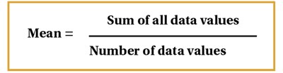
Figure 1.
This is determined by taking the sum of all data values and dividing it by the number of individual values in the dataset [6], Figure 1. Other complex means include geometric and harmonic means [3]. Geometric means utilise the product of all data values rather than the sum and are often used by professionals in the field of investment and finance, for example, to find the average rate of return. The harmonic mean is calculated by dividing the number of data values by the reciprocal of each number and can be used to find the average of ratios.
The median is defined as the central datum when all the data are arranged or ranked in numerical order. This is a useful measure where data is not symmetrically distributed, or non-parametric data [2]. It is a literal measure of central tendency. So, for example, if there are 11 values, the 6th value would be the median. However, with an even number of values within the data, the median is calculated by the average of the middle two values [4]. Hence, the median is preferred if there are outliers that will hinder the mean inaccurate.
Finally, the mode is another statistic that is less commonly used. The mode simply represents the most frequently occurring value in a dataset [6]. It is often not a good indicator of central tendency, but is the only means of measuring this in a dataset that contains nominal categories.
Measuring variability and spread
A basic strategy to quantify the spread of data is the range. The range is simply the difference between the smallest and largest value in the data. However, this doesn’t represent much aside from the difference, so it is better to notate the smallest and largest values rather than the single value difference [2].
A dataset that is arranged in order of magnitude may be divided into 100 separate cut-off points known as percentiles. In other words, the xth percentile is defined as a cut-off where x% of the sample has a value equal to or less than the cut off point.
The interquartile range (IQR) is also used to measure how spread out the data is and is therefore a measure of statistical dispersion or variability. Quartiles divide a rank-ordered dataset into four equal parts. The lower quartile is the value that lies above exactly 25% of the data values, and the upper quartile lives above 75% of the data values [2,3]. IQR is equal to the difference between the 75th and 25th percentiles, and includes the middle 50% of values [3]. Note that the interquartile range is not influenced by outliers as much as the range is, hence the IQR is most appropriate for datasets with a highly skewed distribution, as in Figure 2.
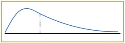
Figure 2.
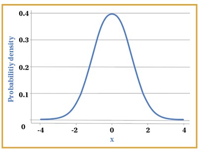
Figure 3.
The most useful and important distribution of data in statistical analysis is the normal or Gaussian distribution, which is characterised by unimodal, symmetrical classic bell-shaped curve, as shown in Figure 3. A considerable amount of biological data is normally distributed, such as height and mean arterial blood pressure in healthy adults. Clinical trial data will also follow a normal distribution provided the sample size is large enough. For data that is normally distributed, standard deviation is predominantly utilised to see how varied the data is around the mean [6].
Normal distribution is based on the mean and standard deviation of a specific set of data, where the data is not too skewed. It is also based around a central value, therefore, the mean, mode and median in a normal distribution are equal as they represent the central value in the symmetrical graph [2,3,7]. In a way, it can be said that the normal distribution represents what would be approximately normal or ‘typical’ in a population with some data values being on the extreme ends, for example patients’ weight. This is an example of parametric data or methods.
However, it is not actually necessary for data from a sample to follow a normal distribution in order to be statistically analysed, provided the data has been drawn from a population that is normally distributed.
Variance tells us how spread out the data is, with the calculation of the variance involving the sum of the squared differences between the data values and the mean, all divided by the total number of data values minus one [4,6]. This calculation is shown in Figure 4. Standard deviation is calculated as the square root of the variance seen in Figure 4. Standard deviation is considered advantageous over the interquartile range owing to the fact that all the data is incorporated. Furthermore, standard deviation is preferred to variance, as the variance squares the given units of the data set, whereas standard deviation is square rooted, thus giving the same units of the data set, which makes it easier to work with [3].

Figure 4.
It is vital to consider here that n-1 is only used as the denominator for samples, but for populations, we use n. If we think about why this is the case, a sample is only a small subset of the population, therefore utilising n-1 gives a smaller denominator, as opposed to simply using n. Consequently, a larger variance is seen, as one would expect to see in the population. Thus, it provides a more accurate value of variance in the sample that will be more relevant to the population from which the sample is taken [3].
It is appropriate to consider z-scores here also. Z-scores calculate how many standard deviations away a data value is from the mean. Considering standard deviations on the normal distribution, we can say that 68.2% of the data is included within one standard deviation away from the mean, on either side. For two standard deviations, 95.4% of the data is included and for three, 99.7% of the data is included [6].
Using the formula for the z-score, as shown in Figure 5 below, we can work out how far away a data point is from the average.
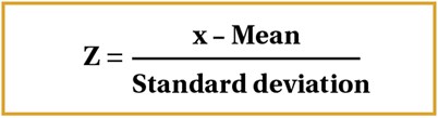
Figure 5.
Z-scores can also be used to work out the probability of a particular value occurring depending on where it lies on the normal distribution [8].
Statistical relationships
Mathematical relationships are examined in different ways.
Correlation refers to the relationship between two sets of paired interval data. Suppose we have data based on the heights and weights of adults, two continuous variables [3]. A linear relationship is formed between these two variables leading to some sort of correlation. For instance, as height increases, weight also increases, leading to a positive correlation. This is usually best represented on a scatter diagram – a graph with an x-axis and y-axis, where data is represented as coordinates [9]. Figure 6 below represents the different relationships on a scatter graph. Note that the closer together the points, the stronger the correlation.
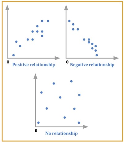
Figure 6.
However, from this alone, we cannot judge the strength of the relationship as there is no numerical value to represent this. Therefore, we can make use of correlation coefficients that provide a numerical basis on the strength of the correlation seen between x and y [2]. The two most commonly used correlation coefficients are Pearson’s and Spearman’s. Note that Pearson’s correlation coefficient is mainly used for data samples obtained from ‘normally distributed’ populations [6]. Otherwise, if the data is skewed, the Spearman’s rank is used. Therefore, Spearman’s is a non-parametric test.
The Pearson’s coefficient is denoted by r, and ranges from 1 to -1, with a value of 1 representing a strong positive correlation and -1 representing a strong negative correlation. 0 represents no correlation, so the closer the value to 0, the weaker the relationship [9]. The formula is represented in Figure 7.
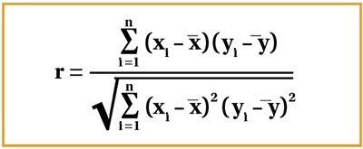
Figure 7.
It is best to approach this stepwise, by working out each individual summation first, although the coefficient is usually worked out using statistical calculators. Consider the x and y graphs in Figure 6 – xi and yi are denoted by the respective coordinates, and so represent the corresponding data values; x1 and y1 would therefore be an example of one set of corresponding data values. The mean of all x and y values are represented by x-bar and y-bar respectively as seen in the formula (Figure 7).
The Spearman’s rank coefficient is denoted by rs. The formula is given in Figure 8.

Figure 8.
In this case, the variables are ranked from highest to lowest – both the x and y variables. The difference for each corresponding observation rank is taken, squared and all of these are summed which represents the summation within the formula. The value of r represents the same as it does with Pearson’s coefficient.
It is vital to note that Spearman’s rank uses assigned ranks, whereas Pearson’s uses the raw data. Hence, if the relationship is monotonic, meaning as x increases, y increases, this would be denoted by Spearman’s as rs = 1. On the other hand, Pearson’s would represent this monotonic relationship differently, maybe as 0.9 or 0.8 as Pearson’s is dependent also on how linear the relationship is – how close the scatter graph may be to forming a straight line [2,3,6].
If two variables demonstrate significant correlation, linear regression analysis can be used to calculate the straight line relationship which may allow us to predict further values. The value being predicted is usually the dependent variable. The term dependent variable is self-explanatory; it is the variable that depends on another variable, whereas the independent variable is not changed by any other variables [3,9]. Manipulation of the independent variable will lead to a change in the dependent variable.
The line of best fit can be given in the form of a straight-line equation: y = a + bx.The line of best fit can be worked out through the method of least squares, with the formula shown in Figure 9. Once the gradient b is worked out through this formula, a can then be worked out by multiplying b with the mean of x and subtracting this from the mean of y [9].
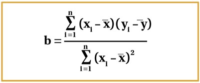
Figure 9.
To conclude, this article demonstrates a key focus on statistical tests and relationships between variables. Part 2 of this series will provide a background on probability and testing, and hope to touch on key elements of medical studies such as hypothesis testing, errors, and other such concepts.
References
1. Romano R, Gambale E. Statistics and medicine: the indispensable know-how of the researcher. Translational Medicine @ UniSa 2013;5:28-31.
2. Bowers D. Medical Statistics from Scratch Chichester, UK; Wiley Blackwell: 2014.
3. Peacock JL, Peacock PJ. Oxford Handbook of Medical Statistics Oxford, UK; Oxford University Press: 2011.
4. Krousel-Wood MA, Chambers RB, Mutner P. Clinicians’ guide to statistics for medical practice and research: part I. The Ochsner Journal 2006;6(2):68-83.
5. Manikandan S. Measures of central tendency: the mean. Journal of Pharmacology and Pharmacotherapeutics 2011;2(2):140-2.
6. Harris M, Taylor G. Medical Statistics Made Easy. Oxfordshire, UK; Scion Publishing Limited: 2008.
7. Krithikadatta J. Normal distribution. Journal of Conservative Dentistry 2014;17(1):96-97.
8. Driscoll P, Crosby M, Lecky F. Article 4. An introduction to estimation--1. Starting from Z. J Accident & Emergency Medicine 2000;17(6):409-15.
9. Bewick V, Cheek L, Ball J. Statistics review 7: correlation and regression. Critical Care 2003;7(6):451-9.
Declaration of competing interests: None declared.